Table of Contents
- What Are BI Visualization Tools?
- Best BI Visualization Tools
- How to Choose the Best Tool for Your Business
- Skyvia’s Integration with BI Visualization Tools
- Conclusion
What Are BI Visualization Tools?
Have you ever wondered how those super cool graphs and charts in business reports come to life? That’s where Business Intelligence (BI) visualization tools come in.
BI visualization tools transform raw data into easy-to-understand, eye-catching visual formats like bar charts, pie charts, heat maps, and more. They convert overwhelming amounts of data into visuals, simplifying the data analysis process. Such tools help businesses see trends, patterns, and insights they might miss by looking at just spreadsheets.
Benefits for Businesses
- Enhanced Decision-Making
- It’s impossible to make a correct decision without seeing all the business data. BI visualization tools solve this problem by simplifying the process of spotting trends and comparing metrics.
- Uncover Hidden Insights
- Sometimes, the most valuable insights are hiding in plain sight. Such tools turn complex data into visual stories so businesses can discover patterns and correlations they might have missed. It’s like having a data treasure map to find bigger revenue.
- Improved Operational Efficiency
- Time is money, and BI tools save plenty of both by streamlining the data analysis process, making it quicker and more efficient. No more sifting through endless spreadsheets. With automated reports and real-time dashboards, businesses can keep their finger on the pulse and respond to changes swiftly. Selecting the tool created for the appropriate ecosystem (Microsoft, Google, etc.) is a good idea for companies already working there.
- Better Collaboration
- Such solutions simplify creating and sharing dashboards, ensuring everyone sees the same information while enabling data-driven decision-making across the company.
Best BI Visualization Tools
Power BI
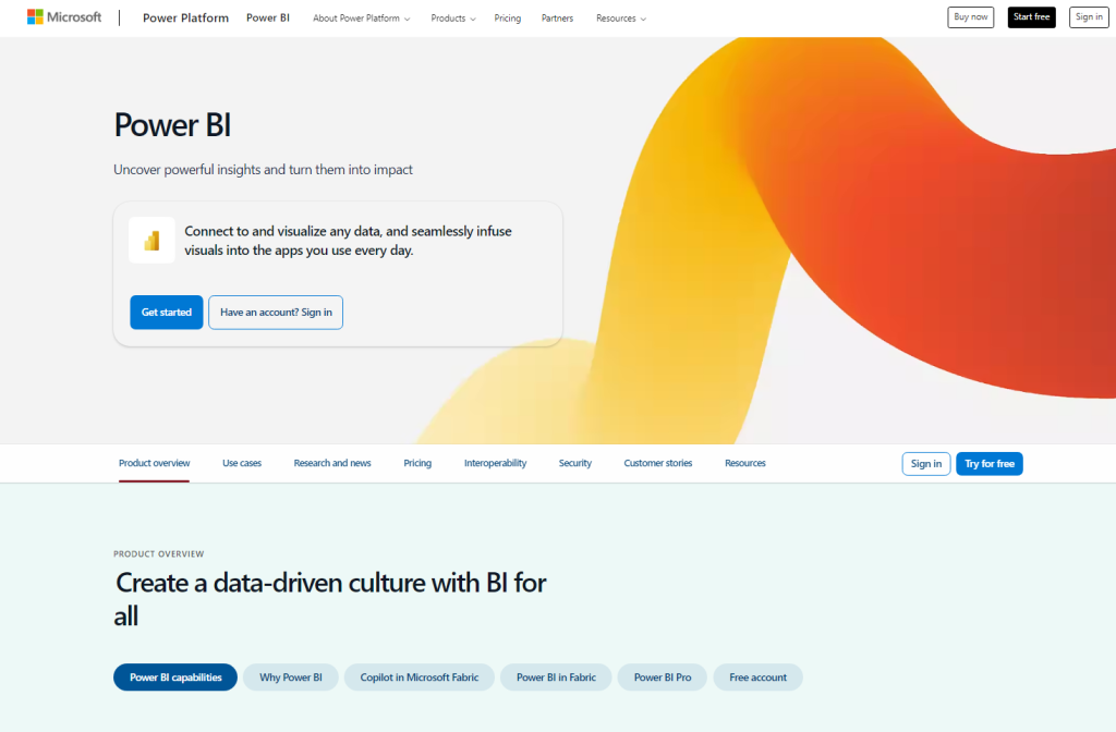
Power BI is created by Microsoft, so it seamlessly integrates with other Microsoft products like Excel, Azure, and SQL Server. If a company is already in the Microsoft ecosystem, Power BI is a natural extension of the existing tools. It helps turn data into interactive and visually appealing dashboards and reports.
The solution is pretty intense in data modeling and allows connecting to various data sources, cleaning and transforming data, and building complex models. It’s perfect for creating a single source of truth, ensuring everyone in the organization is working with accurate and up-to-date information.
Benefits
- Seamless integration with other Microsoft products, like Excel and Azure, makes data import and export a breeze for companies already using these.
- Power BI offers various visualizations, including bar charts, line graphs, pie charts, maps, scatter plots, and more.
- Users can create interactive dashboards that allow viewers to drill down into specific data points, filter information dynamically, and explore data in more detail.These dashboards provide real-time insights and help teams make informed decisions quickly.
- Power BI scales to meet business needs regardless of size. It’s designed to handle big data and can grow with each business.
Drawbacks
- Power BI can be challenging for beginners. There’s much to learn, from data modeling to creating complex visualizations. It might take some time and training to get the hang of it. It’s a good idea to use the Power BI community for help.
- Initial setup and configuration can be tricky, especially for businesses without a dedicated IT team.
Tableau
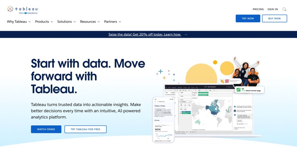
Tableau allows the creation of interactive visuals with just a few clicks. It’s perfect for those who need to dive deep into data and want the freedom to explore it from different angles.
Tableau can connect to various data sources, both on-premises and cloud. Whether users are pulling data from Excel, SQL databases, or cloud services like AWS and Google Cloud, Tableau easily handles it. Its drag-and-drop functionality makes it a favorite among data analysts and visualization experts.
Benefits
- One of Tableau’s biggest strengths is its vibrant and supportive community. There are many resources, forums, and groups where users can find help, share ideas, and learn best practices.
- Tableau allows real-time data analysis. So, users can connect to live data sources and see up-to-date information in their dashboards to make timely and informed decisions.
Drawbacks
- The learning curve can be steep, and getting the most out of Tableau might require some training.
- Tableau excels in data visualization but is not the best choice for handling large-scale production data. Users might need to pair Tableau with other tools for massive datasets or highly complex data operations to do the job efficiently.
Looker Studio
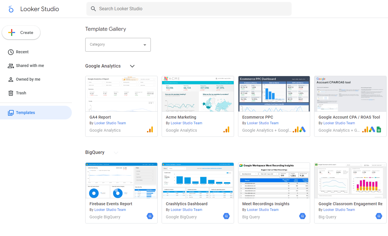
Looker Studio (formerly Google Data Studio) is a free, web-based tool for creating dynamic and interactive dashboards and reports. The tool is convenient for companies already involved in the Google ecosystem.
Its user-friendly drag-and-drop interface is suitable even for non-techs. The solution is perfect for turning data into clear, compelling stories anyone can understand.
Benefits
- The tool is accessible for beginners and powerful enough for more advanced users.
- It’s free and accessible to businesses of all sizes. You don’t need to worry about costly licenses or subscriptions, making it a great option for startups and small businesses.
- It seamlessly connects with Google Analytics, Google Sheets, Google Ads, and more.
Drawbacks
- While Looker Studio is great for visualizations, it might not have all the advanced data manipulation and transformation features that other BI tools offer. If you need complex data modeling, it may be lacking.
- Users report challenges with formatting and customization options. Sometimes, getting reports to look exactly how users need them can be tricky, especially compared to more mature BI tools.
Looker
Looker is part of the Google Cloud Platform, helping businesses explore and analyze data like a pro. Its unique modeling language, LookML, allows users to define complex data relationships and create reusable data models.
Looker smoothly integrates with various SQL databases and cloud storage solutions, allowing companies to work with data from multiple sources. It provides robust analytics and empowers users to build sophisticated data models that drive meaningful insights.
Benefits
- LookML allows the data team to define intricate data relationships and create reusable models, making it easier to maintain consistency and accuracy across all reports and dashboards.
- Looker offers pre-built templates known as Looker Blocks, ready-to-use pieces of code that users can plug into their projects, saving time and effort. They cover common analytics needs and can be customized to fit specific requirements.
- Looker handles large datasets and complex queries, making it good for enterprises with extensive data needs. Its ability to connect to a wide range of data sources ensures that data can be pulled in from wherever it is needed.
Drawbacks
- While Looker is fantastic for data modeling and analytics, its visualization options are limited compared to other BI tools like Tableau or Power BI.
- Looker often requires additional tools or software before starting the analysis.
Note: While Looker and Looker Studio are valuable BI tools, they cater to different needs and user bases. Looker Studio is perfect for quick, user-friendly data visualization, especially for those already using Google services. However, Looker offers advanced data modeling and analytics abilities, making it a better fit for larger enterprises and more complex data environments.
Chatrio
Atlassian acquired Chartio in February 2021, with all its data visualization abilities. So, if a company uses Atlassian products like Jira, Confluence, and Trello, it now has more powerful tools to understand and use its data.
Chartio fits perfectly into Atlassian’s ecosystem, enhancing its collaboration and productivity tools suite with robust data visualization and analytics features.
Benefits
- Chartio’s user-friendly interface makes it easy to set up and use, even for non-technical users. Without extensive training, users can quickly connect data sources, build visualizations, and share insights with the team.
- As part of Atlassian, Chartio continues to offer an affordable option for small to medium-sized businesses or teams with limited budgets. They get top-notch data visualization abilities without a hefty price tag.
- With Chartio integrated into Atlassian’s suite, teams can collaborate more effectively. They can create dashboards that pull data from Jira projects, visualize Confluence data, and effortlessly share insights across the organization.
Drawbacks
- While Chartio is fantastic for basic to intermediate data visualization, advanced data analysts might need wider data modeling abilities and complex analytics features.
- Although Chartio offers a range of visualization options, it may not provide the same level of customization and intricate design features as other BI tools. Businesses needing customized and interactive dashboards may encounter some limitations.
Sisense for Cloud Data Teams
Sisense for Cloud Data Teams, formerly known as Periscope Data, is for those who live and breathe SQL. It empowers data teams to analyze and visualize data efficiently using their favorite languages, like SQL, Python, and R. If you’re an SQL expert looking for a robust platform to handle complex data analysis and create stunning visualizations, Sisense has got you covered.
This tool integrates with various cloud data warehouses, making it perfect for teams working with big data. It allows businesses to explore data deeply and turn it into actionable insights.
Benefits
- Sisense excels in handling complex queries and large datasets, making it efficient for deep data analysis. Users can write advanced SQL queries to pull and transform data, ensuring they get the necessary insights.
- Sisense integrates with various cloud data warehouses, such as Amazon Redshift, Google BigQuery, and Snowflake, ensuring easy access to the data sources and the ability to start analyzing without a hitch.
Drawbacks
- Users unfamiliar with SQL might find it challenging to use this tool effectively.
- While Sisense’s power and flexibility are great for advanced users, they can be overwhelming for those who are less experienced with data analysis or who prefer more straightforward, drag-and-drop interfaces.
How to Choose the Best Tool for Your Business
Picking the right BI visualization tool for your business can seem like a daunting task. The step-by-step guide below outlines the steps to choosing the perfect tool.
Identify Your Business Needs
- What kind of data are your company working with? (e.g., sales data, customer data, financial data).
- Who will be using the tool? (e.g., data analysts, marketing teams, executives).
- What are your key objectives? (e.g., real-time insights, detailed reporting, data integration).
Determine Your Budget
- BI tools come in all price ranges, from free to premium options. Determine your budget early on to narrow down the choices.
Evaluate Ease of Use
- Consider the tool users and their level of technical expertise. Choose a tool that matches your team’s skill level to ensure smooth adoption.
Check Integration Capabilities
- Ensure the BI tool can integrate with the existing data sources and systems.
Analyze Data Processing Needs
- Determine whether you need real-time data processing or batch processing is sufficient.
Assess Visualization Features
- Look at the types of visualizations each tool offers. They are depending if you need simple charts and graphs or more complex, interactive dashboards.
Consider Scalability
- Think about your future needs. Ensure the BI tool can handle increasing data volumes and more complex queries as your business expands.
Evaluate Support and Community
- Check out the level of support and the user community available for the tool. A strong community and good customer support can be invaluable, especially when you’re just starting.
Take Advantage of Trials and Demos
- Many BI tools offer free trials or demos. Use these opportunities to test the tools in your environment and see how they handle data.
Gather Feedback
- Gather feedback from the team. Make sure the tool you choose meets the team’s needs and preferences.
Skyvia’s Integration with BI Visualization Tools
Whatever tool you choose, you must understand that it requires consolidated, cleaned data. Usually, the data is scattered across different systems. However, Skyvia’s integration abilities ensure that the data flows effortlessly between data sources and consolidates in DWHs for further analysis within BI tools. This flexibility means a company can choose the best tool for its needs without worrying about compatibility issues.
Skyvia simplifies data integration and backup processes. It’s a powerful, no-code ETL, ELT, and Reverse ETL data integration platform that provides 180+ pre-made connectors, including cloud apps, databases, data warehouses, and CRMs. According to the last G2 Crowd rate, it’s among the top 20 easiest-to-use ETL tools.
Additional Benefits of Using Skyvia
Scalability and Flexibility
- Skyvia can easily scale to accommodate more data sources, larger datasets, and more complex data workflows as the business expands.
- Cost Efficiency
- By using Skyvia’s cloud infrastructure, organizations can reduce the costs of data integration and management, freeing up resources for other strategic initiatives.
- Enhanced Data Security
- Skyvia uses encryption to ensure data is secure in transit and at rest by providing secure data handling and storage solutions.
- Scheduling
- Skyvia’s automation features allow scheduled data integration tasks to run at specific times, ensuring that data is always up-to-date without manual effort.
- Automation reduces human error risk and frees the team to focus on more strategic tasks.
Find out more! Here is the story of success: how Horizons elevated its data insights and visualization abilities with Skyvia.
Conclusion
BI visualization tools like Power BI, Tableau, Looker, Sisense for Cloud Data Teams, etc., stand out for their unique strengths in data integration, visualization, and analysis.
Skyvia emerges as a robust platform, seamlessly integrating with these top BI tools to ensure data flows effortlessly and is always ready for analysis. This platform enables centralized data management and enhanced data security, making it an indispensable part of businesses’ data strategy, not depending on the business size.